Behind the Book Cover
How we landed the cover design for "Push Off from Here," the designs that didn't make the cut, and why.
FIRST! Push Off from Here drops in 20 days. Pre-order it now, and save your receipt to get access to the launch party with my hilarious and wonderful friend, author, and host of Terrible, Thanks for Asking Nora McInerny.
I love book covers so much. How many times have I bought a book solely based on the cover? Too many. Do I get mad if the book isn’t as great as the cover? Nope, because art.
Like so many other aspects of publishing, the process of designing a cover is mysterious to most. Who designs it? How many choices does the author get? Who ultimately decides, the publisher or author? What makes a great cover?
Let’s discuss.
The cover design process for Push Off from Here
Just before Christmas in 2021, in the thick of writing the book, I sent over my initial ideas for the book cover design. This included comps of other book covers I liked, color and font preferences, and any notes to help direct the creative team. In true Virgo fashion, I created an annotated presentation.
My editor took my “creative brief” and worked behind the scenes with the creative team at Random House to start creating comps, or potential versions of the cover. In March 2022, I saw my first round of designs.
Round one designs

While we liked elements of some of these, none of them felt right, or really even in the right neighborhood. They were too flat and clinical—more like a business strategy book than something about the emotional experience of sobriety and change. Not enough movement, not enough energy. We did love the orange/pink/blue colors, but the rest was scrapped.
Back to the drawing table.
Two months later, in May, I received the next round. What I didn’t know at the time was between the first and second rounds I saw, my publishing team had gone through many rounds behind the scenes. They didn’t deliver a new set to me until they had ideas they really loved and would publish.
Round two designs
My editor and agent really liked these. They were an improvement from the first round to be sure: beautiful movement, the swirling paint motif conveys the messy, intense process of change, and the colors themselves—bright orange, red, purple, blue—are dramatic yet hopeful. The various fonts each communicate a different tone, too; the scripts convey a more casual, personal vibe, while the block fonts are more strong and bold.
My initial reaction was something like, Huh…Okay…I like these…I think…Wait…Yes, I do…I mean, do I? Definitely not a full-body yes, but I thought there was potential. The red-heavy backgrounds were out, but I dug the orange, blue, and purple. I was wary of using the full bleed watercolor paint theme that’s so popular these days because I didn’t want it to look the same as so many other recent books, and I was worried it wouldn’t age well (based on zero data or research). I also knew I didn’t want a script font of any kind—the WATL cover uses one, and I didn’t want that to become a theme for my books.
Oh, I wanted to love one of these because I wanted to be agreeable, and my publisher was so keen. This was the winner of the bunch.
I asked to see several variations on this type of background that were less “paint on canvas” looking, and my publisher delivered.
Round three designs (a sampling, there were many)
After seeing the above and many more, we kept going back to my original favorite. On a Friday in late July (note: we’d been at this for eight months now), I told my publisher I was good with it, and let’s go.
That weekend I couldn’t sleep. It wasn’t the cover I really wanted. I knew it wasn’t it. I frantically emailed my editor and asked (begged) for another round. I gave her more (probably confusing) ideas. I felt like such a pain in the ass, plus, maybe I was wrong? Publishers don’t just wing it on covers; they have a good sense of what works and what sells. And just because I wanted a different one didn’t mean I would get a different one. But I had to try.
We hopped on zoom the following Monday and talked—me, my agent, and my editor. She showed me a few options they’d turned down earlier in the process to give me an idea of what they’d said no to and why.
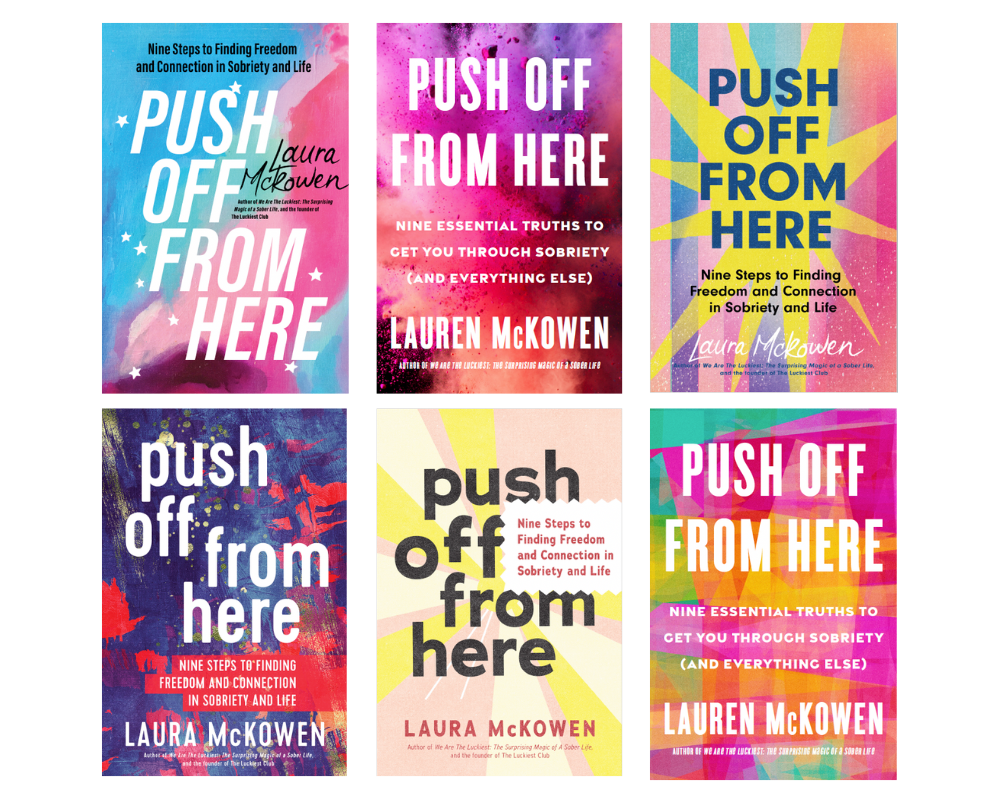
Some of the designs that never made their way to my inbox
When I saw this one, I lit up. I liked it. Bright, exciting, with a hint of the ethereal, even magic. My name is wrong, but: details!
My editor went back to the team over the weekend, and they ultimately turned it down on account that it looked too much like Elizabeth Gilbert’s Big Magic. Fair. I was a bit bummed, but not devastated (it still didn’t feel like “it,” but it felt more “it” than the current contender).
They were going to huddle and come back to me again.
Here’s where it’s important to say that the publisher ultimately makes the final decision on the cover design. Any good publisher wants the author to be thrilled about their cover, but that doesn’t always happen, and it’s not their top priority. Their top priority is producing a book that will sell.
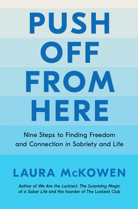
A few days later, I received an email from my editor saying they went back to the title and the images it brought to mind when they first heard it: a swimmer pushing off from the side of a pool, a boat setting off from the harbor, the ocean tide. In other words: water. This is something we talked about in our initial meetings and I literally write about it in the book, but somehow it got away from us. In her email, she attached these designs, and gently let me know we couldn’t go back for another round after this, so hopefully there was a winner in the bunch. If not, we’d go with the previously chosen one.
The final round
And…
I knew it right when I saw it. It was the full-body yes. I squealed. I danced. I texted everyone who cared, and probably some people who didn’t. Much email celebration ensued. We’d nailed it in the 11th hour.
And that’s how it went down! I couldn’t be happier. Blue and purple are my favorite colors, the ocean is sacred to me, and the whole thing together delivers the juxtaposition of strength vs. softness and power vs. grace that I aim to convey in the book.
Book covers are hard, and non-fiction books are even harder, but I think we won on this one.
Any questions? War stories? Favorite book covers? Share.
Lastly, if you like one of the other designs better or think we made the wrong choice, please, for the love of God, keep that opinion to yourself. That’s like tagging an author in a lukewarm review of their book on Instagram. Just don’t.
Love,
Laura
20 days until the release of Push Off!
Preorder Push Off from Here, coming March 7. Save your receipt to get access to my launch party with my hilarious and wonderful friend, author, and host of Terrible, Thanks for Asking Nora McInerny.
Join Nora and me on March 8, 7 pm ET. Register now!
Catch me on book tour!
Almost all the dates have been announced (Denver and Toronto will be added this week!), and you can check the dates and buy tickets here.
Join The Sober 90, beginning March 1
Whether you’re new to sobriety or are already sober but need support, The Sober 90 is the perfect entry point. Registration is now open; we start March 1. Learn more.
Join me at The Art of Living July 21-23
I’ll be teaching my first IRL retreat since 2019 in Boone, NC, this summer! Learn more.


Love this! As women we need so much more of this.....trust your gut, ask for what you need. NO demand it! I feel like that’s a theme with this new book. No more playing small. Can’t wait to read it! Already preordered months ago❤️
So cool to see behind the curtain! I’ve always been curious about how books are branded with covers, titles, etc. thanks for sharing!